Customizing Plots in RStudio
Overview
Teaching: min
Exercises: 45 minQuestions
How do I modify a volcano plot created on Galaxy in R?
How do I create a heatmap of normalized expression in R?
How do I change relevant parameters to improve a plot?
Objectives
Modify important plotting parameters
Make plots that are more visually appealing that the default plots produced by R
Introduction and Outline:
In this tutorial, we are first going to ease into creating figures in R by doing the following:
- Creating a volcano plot on Galaxy from our
**Pre-TREAT basalpregnant-basallactate DE Table**using theVolcano Plottool on Galaxy - Export the code used to create the plot and import it into RStudio Cloud
- Customize elements of the script to customize what the plot looks like
- Create a heatmap from scratch using our own script instead of one from Galaxy
Customizing a Volcano Plot Originally created on Galaxy
Creating the plot on Galaxy
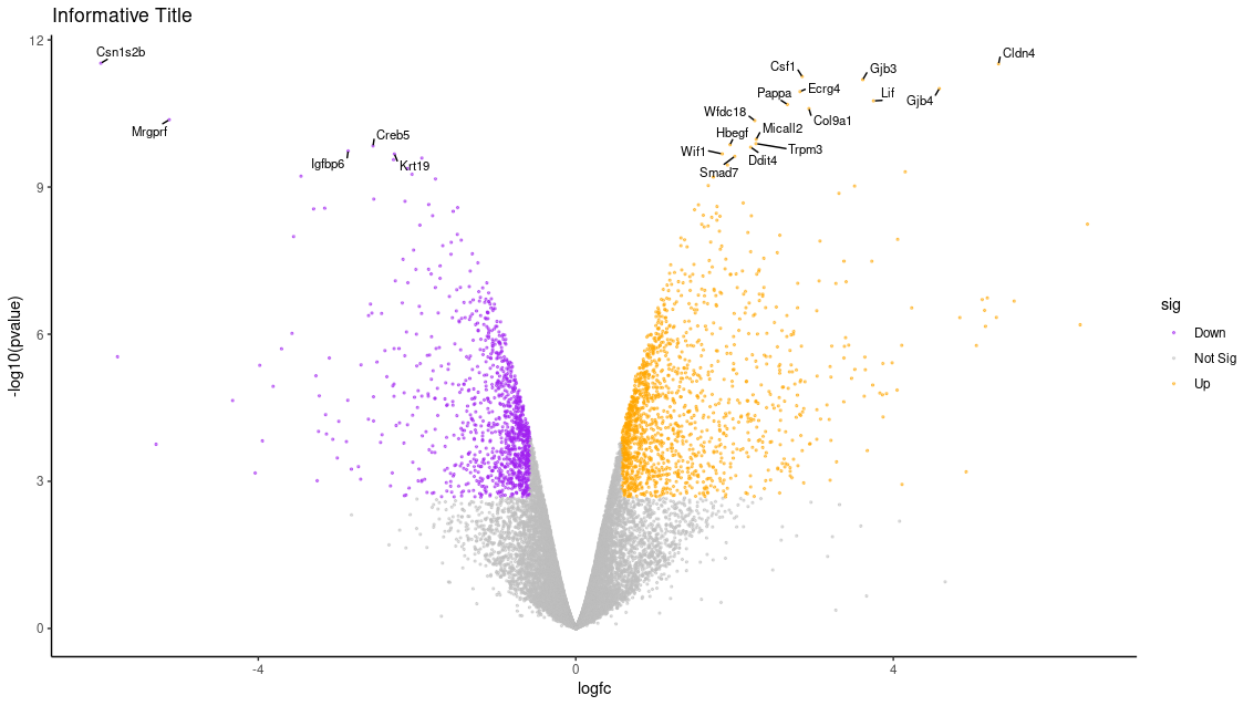
First, we will create a volcano plot colouring all the significant genes. We will call genes significant here if they have FDR < 0.01 and a log2 fold change of 0.58 (equivalent to a fold-change of 1.5) - just as we did during the TREAT step last week. These were the values used in the original paper for this dataset. We will also label the top 10 most significant genes with their gene names. We will select to output the Rscript file which we will then use to edit the plot in R.
For this tutorial, I am assuming you will be using the Pre-Treat output from the basalpregnant-basallactate comparison. If you are not sure if you still have this file ready in your history, you can also go ahead and download it again at this link and then upload it into Galaxy.
Hands-on: Create a Volcano plot
Run the tool to create a volcano plot:
- “Specify an input file”: The DE results file described above.
- “File has header?”:
Yes.- “FDR (adjusted P value)”:
Column 8.- “P value (raw)”:
Column 7.- “Log Fold Change”:
Column 4.- “Labels”:
Column 2.- “Significance threshold”:
0.01.- “LogFC threshold to colour”:
0.58.- “Points to label”:
Significant.- “Only label top most significant”:
10.- In “Output Options”:
- “Output Rscript?”:
Yes.
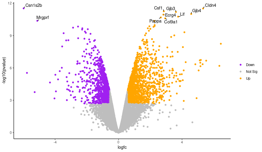
Click on the PDF file name to check that you see a plot like below:
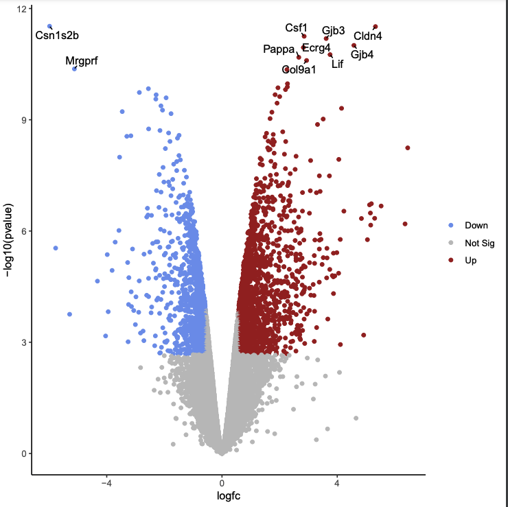
Likewise, if you click on the Rscript item, you will see a bunch of code in R! We will be using this soon. Download this RScript file and save it on your computer as limma-voom-volcanoplot.R.
Editing the Script in RStudio
Now, switch over to your RStudio Cloud environment. Using the Import tool, upload limma-voom-volcanoplot.R from your computer into the default place on the cloud:
Then, upload the file from the virtual environment into R:
If done correctly, it should now pop into the Source window and be ready for you to edit! As it stands now, running the script will NOT work. We need to make at least a few edits to re-create the plot we saw from Galaxy
Hands-On: Editing the R Script
1. Delete Unneeded Lines The first few lines from
Galaxy settings starttoGalaxy settings endare settings needed to run the Volcano plot tool in Galaxy. We don’t need them to run the script in R so we will delete them. If we don’t delete the error handling line, the R session will crash if we encounter any error in the code. It’s ok as it will resume again where we were but better to not have this happen. Delete these lines from the top of the script.2. Change where we are finding the input file: We need to change the path of the differentially expressed file in the script. The path in the script is something like
/corral4/main/objects/5/e/5/dataset_5e5c4768-8786-4265-8fb1-f1abb8054662.dat. This is a temporary location where the Galaxy Volcano plot tool copied the input file in order to use it, the file no longer exists there. FindImport Dataline and edit it to look like the following (this is the exact command that we used in to upload this file in the previous tutorial).results <- read.csv("limma-voom_basalpregnant-basallactate.csv")
- Save the file, select the whole script (Ctrl/CMD+a), and then press
Runor the shortcut equivalent (CTRL/CMD+Enter).
You should see a file called volcano_plot.pdf appear in the Files pane. Click on it to open it and you should see a plot that looks the same as the one we generated with the Volcano Plot tool in Galaxy. We’ll delete the lines below that save the plot to a PDF file. The plots will then be produced in the Plots pane so we can more easily see the different plots we’re going to make, without having to keep opening the PDF file.
Hands-On: Editing PDF options in script
- Delete the lines below that save the plot to a PDF file, but don’t touch any of the lines between:
pdf("volcano_plot.pdf") dev.off()- As above, Highlight the code in the script and run. You should now see the plot produced in the Plots pane.
Customizing the volcano plot
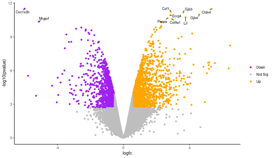
We’ll demonstate how you can change the colors. We’ll change the colour of the downregulated genes from cornflowerblue to purple. We’ll change the upregulated genes from firebrick to orange. If you want to use other colors you can see the built-in R colors with their names in this cheatsheet. Then, we will explore a few other options for customizing features of the plot.
Hands-On: Changing Plot Colors
- Change the line listed below from the top option to the bottom option:
colours <- setNames(c("cornflowerblue", "grey", "firebrick"), c(down, notsig, up)) colours <- setNames(c("purple", "grey", "orange"), c(down, notsig, up))- Highlight the code in the script and run! Hopefully your plot will look something like this:
Hands-On: Changing label text size
Edit the line below in the script from the top line to the bottom line, and then run the script again.
geom_text_repel(data = filter(results, labels != ""), aes(label = labels),
geom_text_repel(data = filter(results, labels != ""), aes(label = labels), size = 3,
Hands-On: Changing the point size
Edit the line below in the script from the top line to the bottom line, and then run the script again.
geom_point(aes(colour = sig)) +
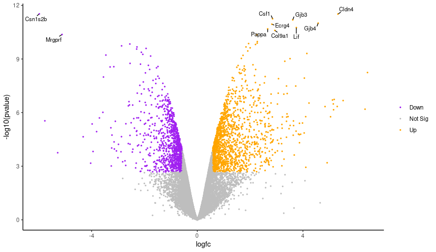
geom_point(aes(colour = sig), size = 0.5) +
Challenge: Other Parameters
Hint: You may need to do some Googling!
How would we change the number of top genes we label?
How could we change the transparency of the points?
How can we add an informative title?
Solution
Find somewhere that specifies the number 10, and then change it to 20! Specifically:
top <- slice_min(results, order_by = pvalue, n = 20).Looking at the
ggplotdocumentation, we see that thealphaparameter controls transparency. Decreasing this parameter to below 1.0 will make the points partially transparent:geom_point(aes(colour = sig), size=0.5, alpha = 0.5).Get rid of the line
p <- p + theme(legend.title = "element_blank()"), which essentially tells R that we don’t need room for a title, and instead replce it withp <- p + labs(title="Informative Title"). Thelabs()function lets you customize all of the labels usually found on a graph.
Here is what the plot looks like with all of those adjustments:
Final Modifed Script: If you are stuck anywhere with modifying the script or are concerned you messed up the formatting, here is a copy of the script I came up with that includes all of the modifications that created this final plot: modified-limma-voom-volcanoplot.R.
But wait, there’s more!
There are SO many other options you can modify to make your volcano plot your own and suit your particular tastes. You will be exploring thse options during this week’s practical! This is a great resource for learning more about the available parameters and customization available through the
ggplot2package: https://biocorecrg.github.io/CRG_RIntroduction/volcano-plots.html.
Creating and Modifying a Heatmap
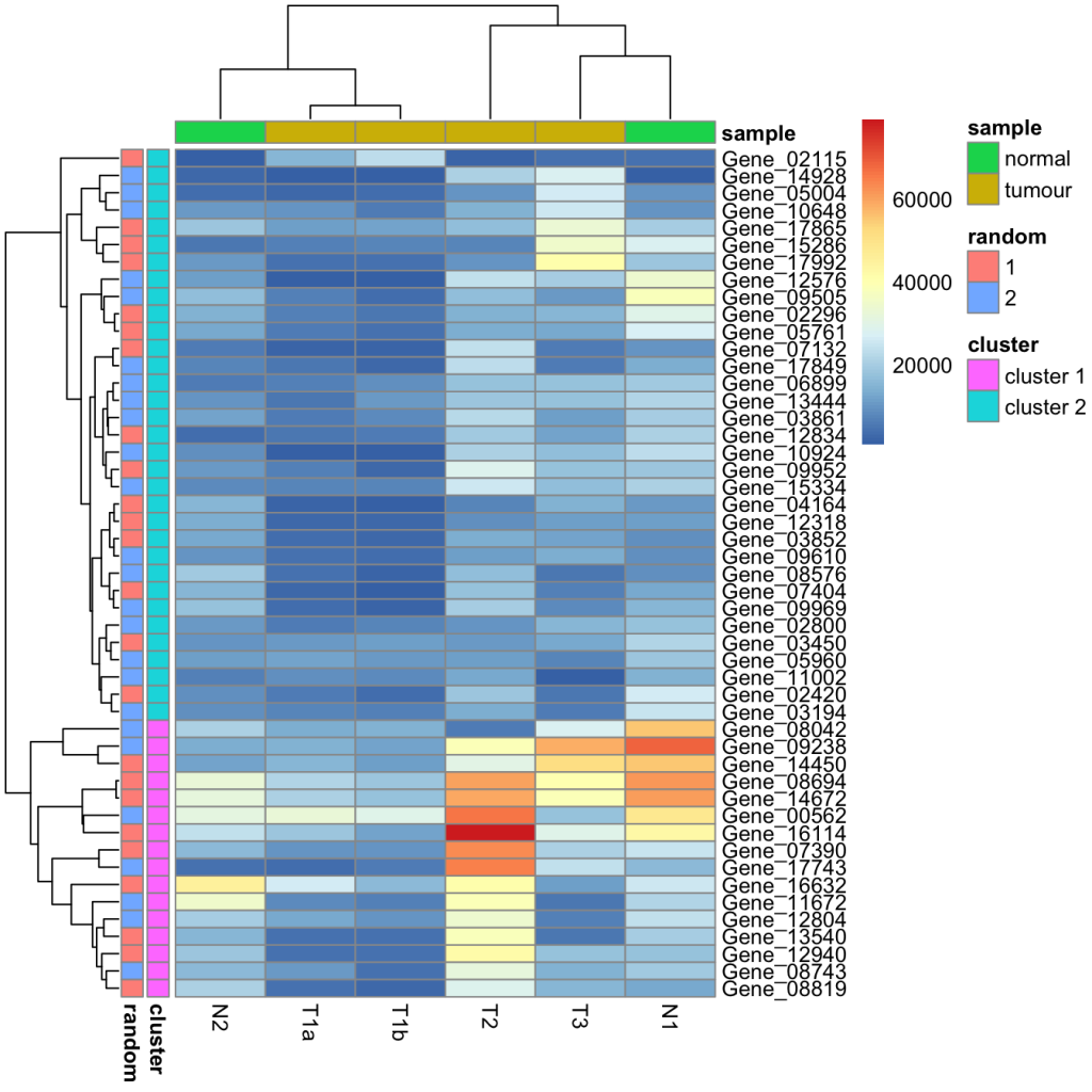
Heatmaps are really powerful for examining patterns in your data, specifically those related to whether certain samples or variables cluster together. It’s also called a false colored image, where data values are transformed to color scale. Heat maps allow us to simultaneously visualize clusters of samples and features. First hierarchical clustering is done of both the rows and the columns of the data matrix. The columns/rows of the data matrix are re-ordered according to the hierarchical clustering result, putting similar observations close to each other. The blocks of ‘high’ and ‘low’ values are adjacent in the data matrix. Finally, a color scheme is applied for the visualization and the data matrix is displayed. Visualizing the data matrix in this way can help to find the variables that appear to be characteristic for each sample cluster. Here is an example created with the heatmap.2() function that we will be using:
We are going to create a heatmap that will allow you to cluster samples based on their expression levels of different genes, or conversely, cluster genes based on their expression in different samples. To do this, we will be working with normalized count data, which are the read counts adjusted for the size and variance in the individual sequencing libraries to make comparisons between samples more accurate. Here is an example of the type of plot that can be created:
Preparing data and environment
Now is your time to practice installing a package! We need the heatmap.2() function from the **gplots**package specifically. WARNING: This may take a few moments, depending on your internet speed.
install.packages("gplots")
library(gplots)
Download this file normalized counts file onto your computer and upload it to RStudio Cloud: Basal Normalized Counts. Read it into your environment, and make sure it is the dimensions we expect (9 columns, 15804 observations, and a header). This represents the normalized count values for all of the genes that were differetially expressed in a multiway comparison between all basal AND lactate samples in the original publication.
norm_counts <- read.csv("limma-voom_basal_normalised_counts.csv")
Read in our whole DE basalpregnant vs. basallactate DE results:
pregnant_lactate_limma <- read.csv("limma-voom_basalpregnant-basallactate.csv")
Making the data set more manageable by selecting top genes
It will take heatmap.2() a long time to render our plots if we are dealing with all 15804 genes in the original data frame. Let’s select only the top 100 differetially expressed genes in our basalpregnant vs. basallactate comparison.
To do this, we will need to:
- Sort the DE results by the
adjusted p-valuevariable in reverse order - remember smaller p-value means more significant! - Select the genes with the smallest 100 p-values.
- Extract the rows of
norm_countsthat correspond to those genes.
I will show you how to do this step-by-step in Base R. If you are familiar withdplyrsolutions, go for it!
Sorting the data by adj.P.Val. The default setting for the order() function is ASCENDING, which is perfect for our use case:
pregnant_lactate_limma_sort <- pregnant_lactate_limma[order(pregnant_lactate_limma$adj.P.Val),]
Now that they are sorted, we will just take the first 100 rows:
pregnant_lactate_limma_top100 <- pregnant_lactate_limma_sort[1:100,]
Find and extract using the corresponding norm_counts rows using the %in% operator.
top_norm_counts <- norm_counts[norm_counts$SYMBOL %in% pregnant_lactate_limma_top100$SYMBOL,]
It is fine that you will only have 99 genes - this is an effect of working with normalized count data for the entire 12-sample comparison. This set will work for our example!
Creating a matrix input for the heatmap
heatmap.2(x=top_norm_counts)
Uh oh, this produced an error: Error in heatmap.2(x = top_norm_counts) : x must be a numeric matrix !! This function expects a numeric matrix (a two-dimensional data frame where the data is all numeric). Luckily, we can fix this in a few quick steps:
- Make the Gene Symbol column into the data frame’s row names, instead of a column.
- Remove extraneous columns, besides the actual count data.
- Convert this final data frame into a matrix.
row.names(top_norm_counts) <- top_norm_counts$SYMBOL
top_norm_counts_relevant <- top_norm_counts[,4:9]
top_norm_counts_mat <- as.matrix(top_norm_counts_relevant)
We can double check that the structure of the matrix is as we would expect using str(top_norm_counts_mat).
 num [1:99, 1:6] 3.1 4.22 4.22 5.56 8.28 ...
 - attr(*, "dimnames")=List of 2
  ..$ : chr [1:99] "Col9a1" "Nuak2" "Lrrn2" "Atp2b4" ...
  ..$ : chr [1:6] "basalvirgin1" "basalvirgin2" "basalpregnant1" "basalpregnant2" ...
Creating the heatmap
heatmap.2(x=top_norm_counts_mat)
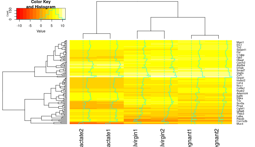
Hmm, we have a heatmap, but it leaves a lot to desire. One thing to notice is that heatmap.2() creates Z-scores that correspond with the colors in the key - this is a measure of whether or not a particular variable is relatively large (high values) or relatively small (low values). Now, Let’s make some modifications!
Useful arguments include:
- Rowv, Colv : process clustering of columns or rows (default TRUE to both).
- dendrogram : show dendrogram for row, col, both or none.
- scale : scale data per row, column, or none.
- col : dendrogram color palette.
- trace : control the cyan density lines.
- RowSideColors, ColSideColors : block of colors that represent the columns or the rows.
- labRow,labCol : remove or keep row or col labels.
- main : title.
- xlab, ylab: x-axis or y-axis label.
First, let’s get rid of those density lines usingtrace, for us, they are just distracting, and let’s give it a quick title and label those axes:
heatmap.2(x=top_norm_counts_mat,trace="none", main="basalpreg vs. basallac: Top 100 DE Genes", xlab="Sample", ylab="Genes")
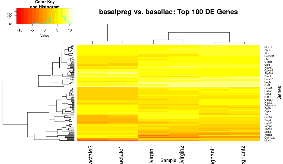
This plot shows some nice bands of genes that have similar expression patterns in similar samples (i.e. those that are very downregulated (red) in the basal_lactate samples). However, let’s scale the genes (rows) so that highly expressed genes are not swamping out this pattern:
heatmap.2(x=top_norm_counts_mat,trace="none", main="basalpreg vs. basallac: Top 100 DE Genes", xlab="Sample", ylab="Genes", scale="row")
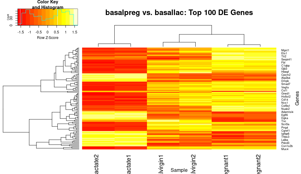
Okay, wow! That gives us a lot more contrast between different genes, and really makes those patterns pop. However, I would personally love to make this the classic blue-red scale that you see in differential expression plots in publications.
heatmap.2(x=top_norm_counts_mat,trace="none", main="basalpreg vs. basallac: Top 100 DE Genes", xlab="Sample", ylab="Genes", scale="row",col="bluered")
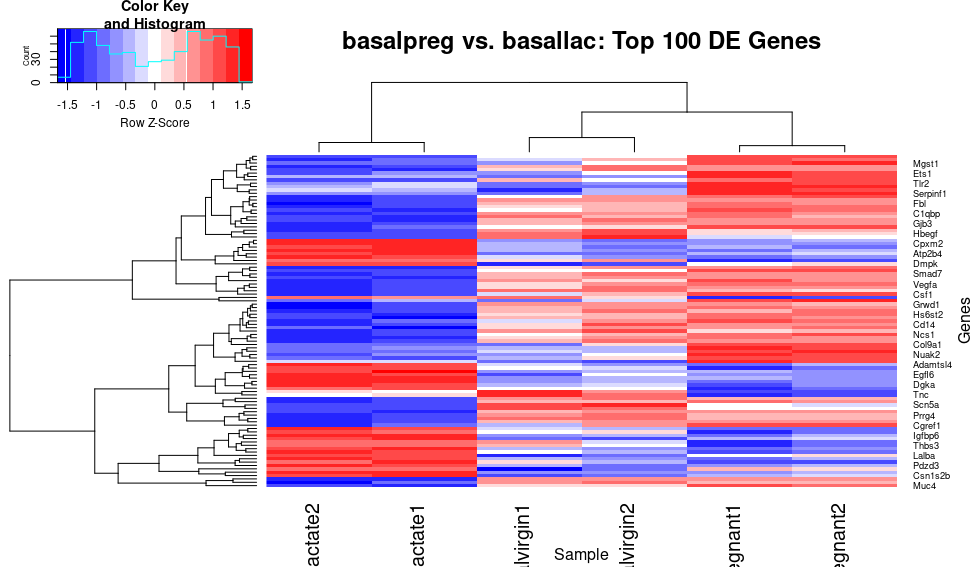
Excellent! Now genes that are relatively lowly expressed in a sample (negative Z-score), are “cold” blue color, whereas the highly expressed genes (positive Z-score) are in a “warm” red color, which seems intuitive (at least to me!). Now, there are probably still a few things bothering us…for example, the sample lables keep getting cut off, and I think we could simplify the key and get rid of the unnecessary dendogram for the columns (since we are only really interested in the gene clustering):
heatmap.2(x=top_norm_counts_mat,trace="none", main="basalpreg vs. basallac: Top 100 DE Genes", xlab="Sample", ylab="Genes", scale="row",col="bluered",dendrogram="row",keysize=1.0, density.info="none",cexCol=0.5,srtCol=45)
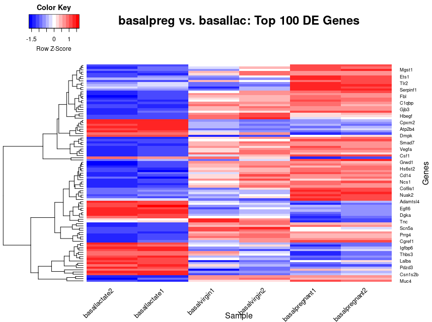
I definitely had to make use of the help(heatmap.2) to see all of the options and additionally had to do some Googling for a few that I couldn’t quite figure out. I will break down everything in this command for you:
x=top_norm_counts_mat: specify what data matrix to plot.trace="none": Don’t plot the density traces lines.main="basalpreg vs. basallac: Top 100 DE Genes": Specify a main title.xlab="Sample", ylab="Genes": Add x and y labels.scale="row": Scale the data by the row variable (genes).col="bluered": Change the color scale.dendrogram="row": only keep the dendrogram for the rows.keysize=1.0,density.info="none": Reduce the size of the key and get rid of the density line in the key.cexCol=0.5,srtCol=45: Change the font size of the column labels and angle the labels to 45” to make them fit.
Challenge: Interpreting the Heatmap
Looking at this final heatmap, what are some observations that you can make?
Possible Solutions:
There are both relatively highly expressed and relatively lowly expressed genes in our
basallactatesample.There are several clusters of genes that are relatively upregulated in those samples and conversely downregulated in the others.
What other patterns can you see?
Key Points
